



A Responsive Web Design Agency That Starts Small First
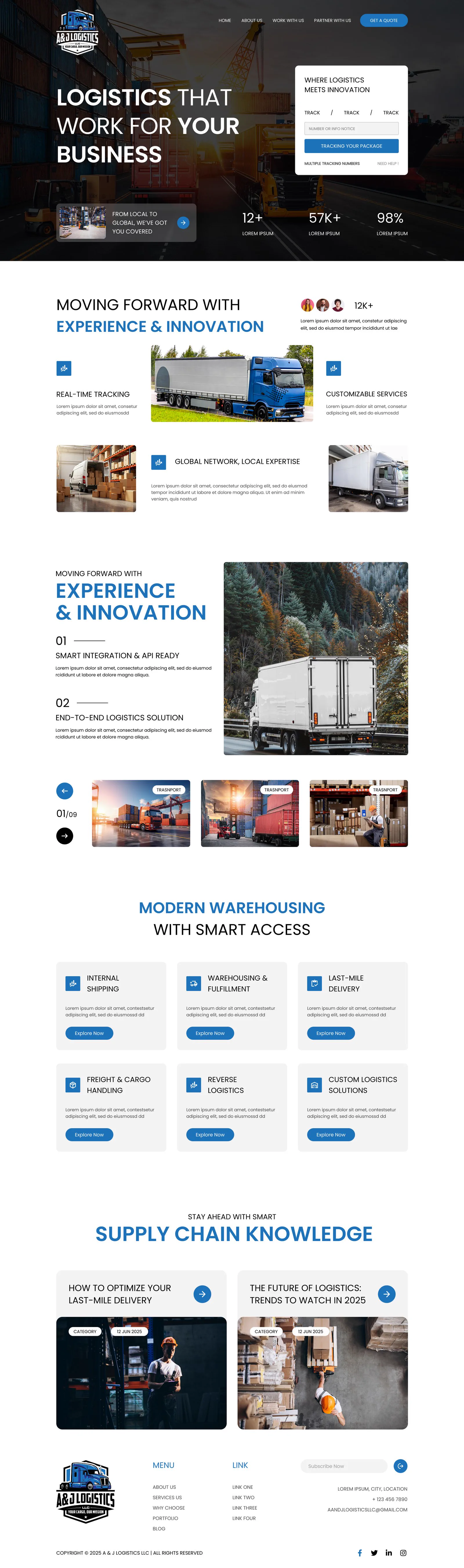
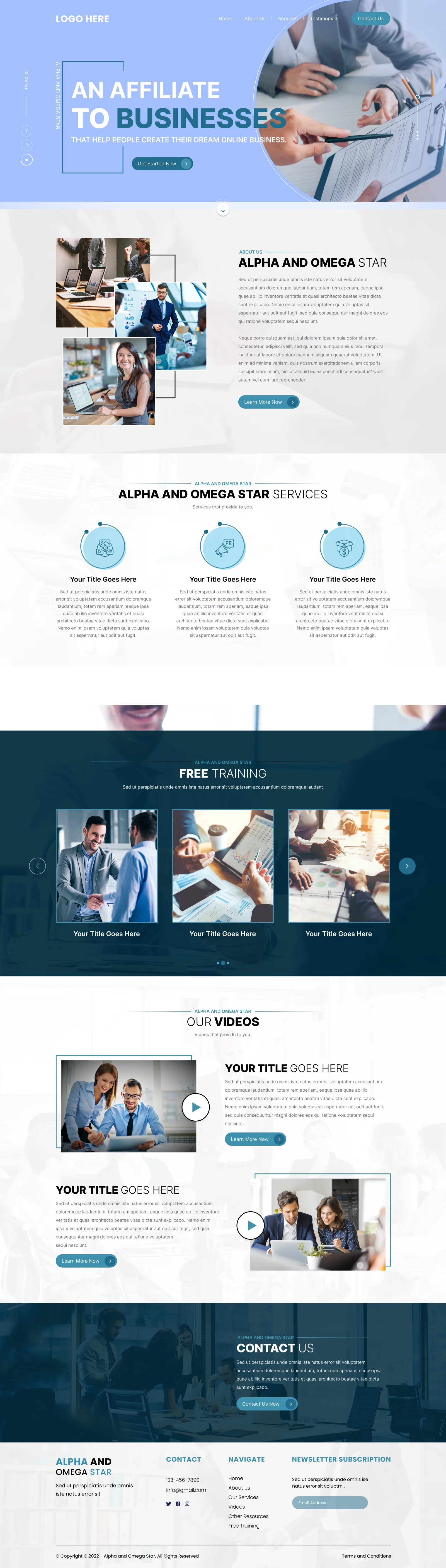
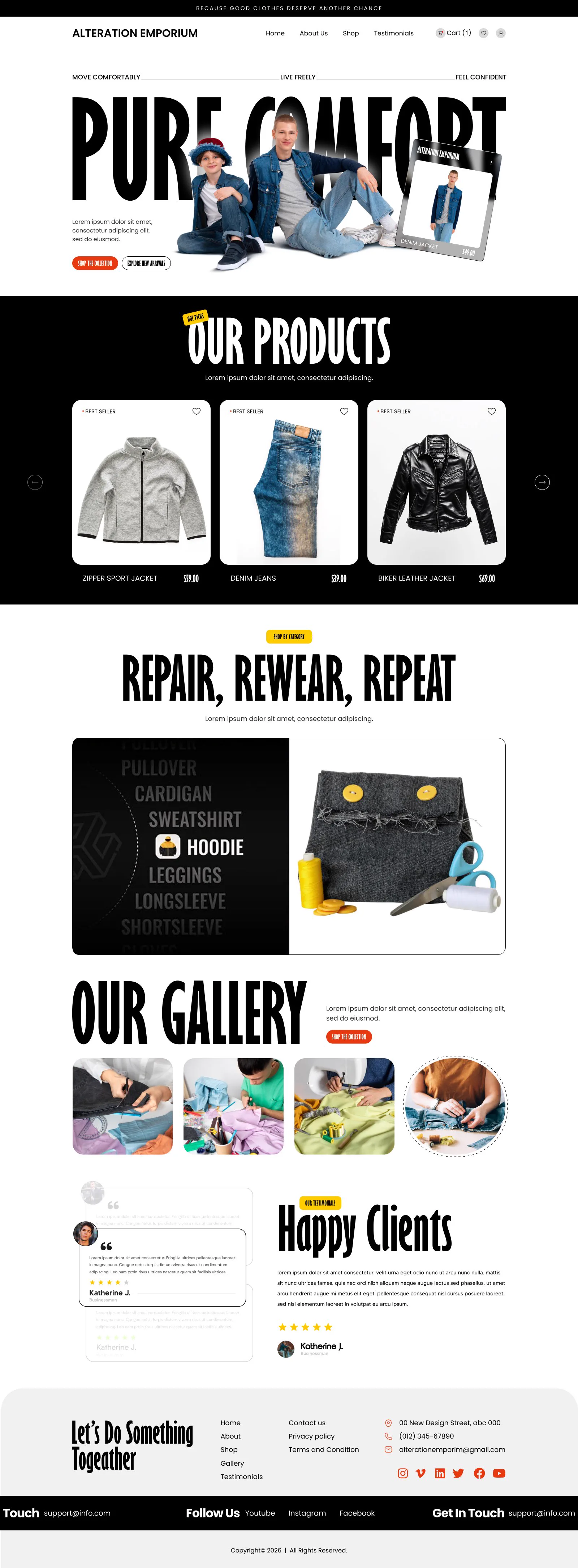
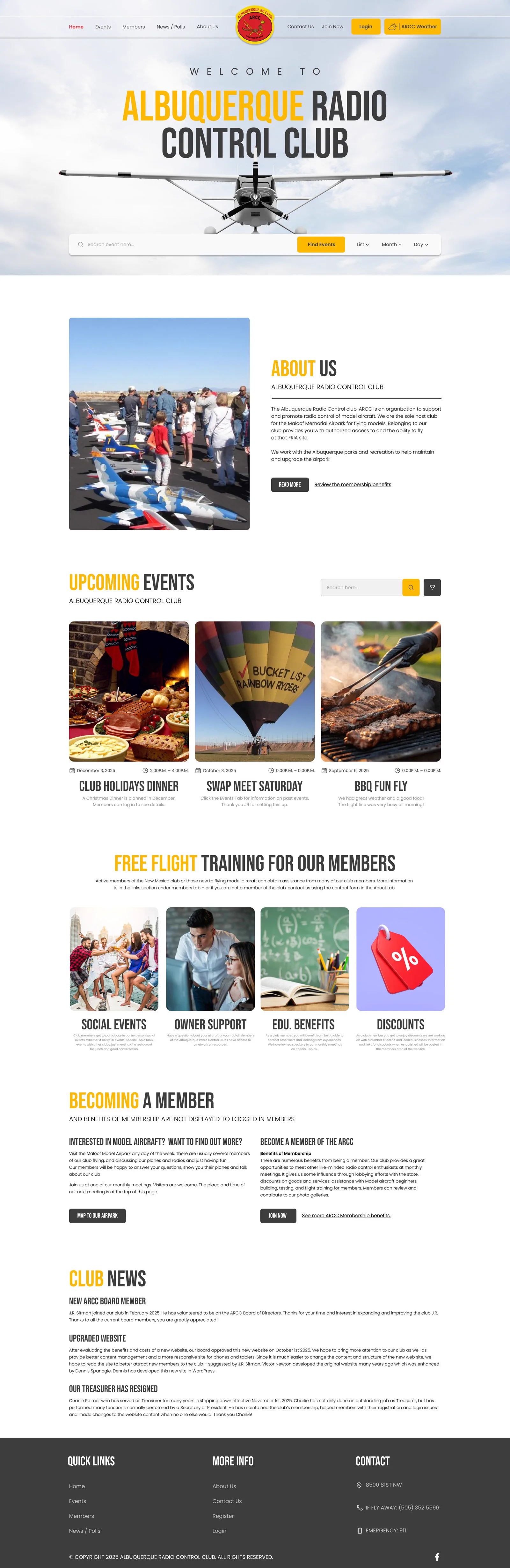
Designing for a large screen first and shrinking it down afterwards tends to produce cramped menus, tiny text and buttons that are genuinely awkward and fiddly to tap.
Our responsive website design services work the other way round entirely, starting with the smallest screen and building outward properly from there, using the same design system as our UI/UX design work.
0%
Clients Satisfaction

0+
Projects Completed
Why Mobile Traffic Deserves More Than an Afterthought
Treating mobile as a smaller version of the desktop site misses how differently people actually use a phone. Attention spans are shorter, thumbs replace a mouse cursor, and connection speeds can be genuinely patchy depending on where someone happens to be standing. Our responsive web design services for UK businesses account for all of that properly, rather than simply making elements smaller and calling the job finished. Navigation gets rethought, not shrunk. Images get properly optimised, not just resized. Every decision considers how someone actually holds their phone.

Business With Us!

Services We Cover
Responsive work covering every device your visitors actually use, built properly from the start rather than patched together afterwards.
Design built starting from the smallest screen upward, so mobile visitors get a considered experience rather than a squeezed one.
Layouts adjusted properly for the awkward in-between screen sizes tablets bring, rather than simply stretching mobile or desktop views.
Thorough testing across real devices and browsers, catching the awkward layout issues that simulators alone consistently tend to miss.
Updating an existing, non-responsive site to work properly across devices without needing to rebuild everything from scratch.
Built for UK Businesses Whose Customers Are Already Mobile
Responsive website design in UK businesses invest in is not just a technical nicety anymore, it is how most customers will actually first encounter your business. As a responsive web design company that treats mobile as the primary experience rather than a secondary one, we build sites that hold up whether someone is browsing from a train, a shop floor or their sofa on a slow connection. Our responsive web design services in UK are tested properly on real devices, not just resized in a browser window and assumed to be fine.


approach

Audit
We check how your current site performs across real devices, identifying exactly where it currently breaks down.

Mobile Wireframes
We map out structure for the smallest screen first, making sure core content and actions are genuinely accessible.

Scaling Up
We expand that structure outward for tablet and desktop, adding detail without ever losing mobile usability along the way.

Build & Optimise
We build the site properly and optimise images and code, keeping load times fast across every connection speed.

Testing
We test thoroughly across real devices and browsers, fixing awkward edge cases before the site goes properly live.
Audit
We check how your current site performs across real devices, identifying exactly where it currently breaks down.
Mobile Wireframes
We map out structure for the smallest screen first, making sure core content and actions are genuinely accessible.
Scaling Up
We expand that structure outward for tablet and desktop, adding detail without ever losing mobile usability along the way.
Build & Optimise
We build the site properly and optimise images and code, keeping load times fast across every connection speed.
Testing
We test thoroughly across real devices and browsers, fixing awkward edge cases before the site goes properly live.
Good To Know
FAQs

-
01 What does mobile-first design actually mean in practice?
It means designing for the smallest screen first, then expanding the layout outward for tablet and desktop.
-
02 Can you make my existing site responsive without a full rebuild?
Often yes. Responsive retrofits can fix many issues without needing to rebuild the entire site from scratch.
-
03 Do you test on real devices, or only browser simulators?
We test on real devices wherever possible, since simulators often miss issues that only show up on actual hardware.
-
04 Will making my site responsive slow down its loading speed?
No, done properly, responsive design should improve load times, particularly for visitors browsing on mobile.
-
05 Does responsive design actually help with search rankings?
Yes, search engines favour mobile friendly sites, so responsive design supports SEO as well as usability.

5-Star Client Reviews Across the UK

Cornelius Whitmore-Ashby
Half our traffic was mobile and the site was borderline unusable on a phone. Fixed properly, not just patched.
Wilhelmina Cartwright
They tested on an actual old Android phone we still had lying around, not just a simulator. Caught issues we would never have found otherwise.
Fitzgerald Osbourne
Tablet users had been a genuine afterthought on our old site. Finally looks intentional at that size now, not just stretched.
Constance Braithwaite
Retrofit ended up cheaper than the full rebuild we assumed we needed, and solved the actual problem just as well.
Peregrine Hardcastle
As a responsive web design agency, they clearly understood how differently people actually use a phone versus a desktop.
Rosalind Fairweather-Hunt
Site finally loads quickly on a slow connection, which matters a lot for our customers browsing on the move.
Half our traffic was mobile and the site was borderline unusable on a phone. Fixed properly, not just patched.
Cornelius Whitmore-Ashby
They tested on an actual old Android phone we still had lying around, not just a simulator. Caught issues we would never have found otherwise.
Wilhelmina Cartwright
Tablet users had been a genuine afterthought on our old site. Finally looks intentional at that size now, not just stretched.
Fitzgerald Osbourne
Retrofit ended up cheaper than the full rebuild we assumed we needed, and solved the actual problem just as well.
Constance Braithwaite
As a responsive web design agency, they clearly understood how differently people actually use a phone versus a desktop.
Peregrine Hardcastle
Site finally loads quickly on a slow connection, which matters a lot for our customers browsing on the move.